Employee Productivity

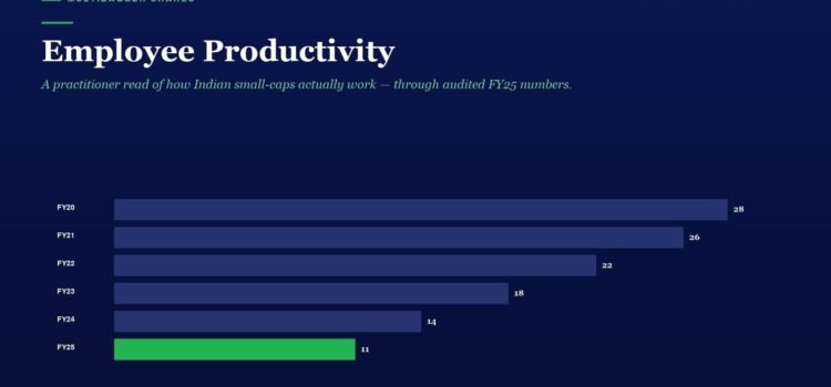
Infographic titled 'Employee Productivity' with horizontal bars showing FY20–FY25 values, peaking at 28 in FY20 and ending at 11 in FY25.

Behind every great company, there are great people. Yet most investors spend hours analysing revenue growth, profit margins, and return ratios — but never once look at how productively a company deploys its most valuable resource: its workforce. Employee productivity

Other Income Quality

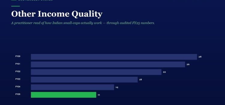
Infographic titled 'Other Income Quality' with six horizontal bars for FY20–FY25; values 28, 26, 22, 18, 14, 11; FY25 bar is green.

When you study a company’s Profit & Loss statement, most investors zoom straight to revenue, operating profit, and net profit. But there is a line item sitting quietly between Operating Profit and Profit Before Tax that can reveal an enormous

Other Income Quality

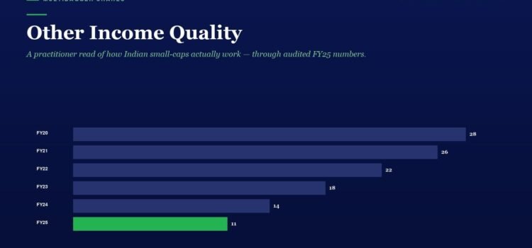
Bar chart titled 'Other Income Quality' showing yearly values FY20–FY25, declining from 28 to 11; FY25 bar is green.

When you study a company’s Profit & Loss statement, most investors zoom straight to revenue, operating profit, and net profit. But there is a line item sitting quietly between Operating Profit and Profit Before Tax that can reveal an enormous

Working Capital Efficiency

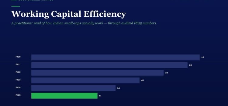
Infographic bar chart showing Working Capital Efficiency from FY20 to FY25; FY20 28, FY21 26, FY22 22, FY23 18, FY24 14, FY25 11 (green bar for FY25).

When investors evaluate a company, they typically look at revenue growth, profit margins, and return ratios. But there is a hidden layer of business quality that separates truly well-managed companies from those that merely look good on the surface: working

Current Ratio & Quick Ratio

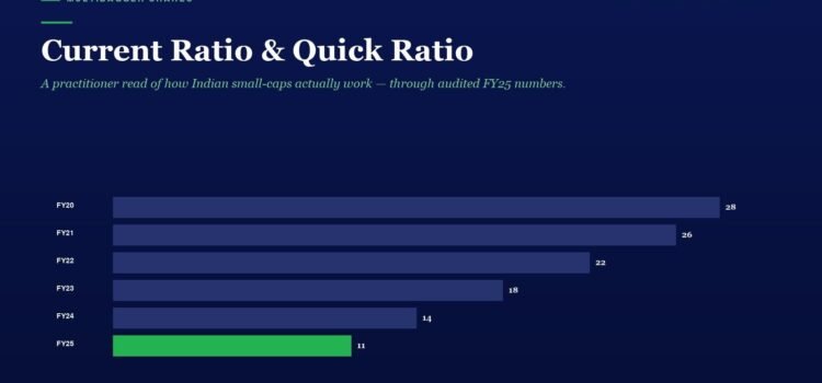
Liquidity bar chart titled 'Current Ratio & Quick Ratio' for FY20–FY25. Dark blue bars show FY20 28, FY21 26, FY22 22, FY23 18, FY24 14; green bar for FY25 11, illustrating a decline in liquidity.

In the world of fundamental analysis, most Indian investors obsess over growth metrics — revenue CAGR, profit growth, ROCE. But ask a seasoned value investor what keeps them sleeping peacefully at night during market crashes, and the answer is almost

Tax Rate Efficiency

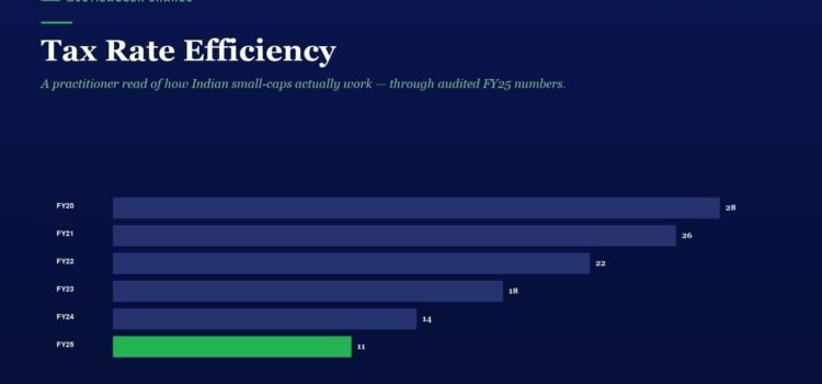
Tax Rate Efficiency: horizontal bar chart of FY20–FY25; bars in dark blue except FY25 in green, with end values 28, 26, 22, 18, 14, 11.

In the world of fundamental analysis, most investors obsess over revenue growth, profit margins, and return ratios. These are important metrics, no doubt. But there is one deeply revealing metric that almost nobody talks about — the effective tax rate.

Vijay Kedia’s SMILE Framework: How India’s Most Unconventional Multibagger Hunter Uses 5 Simple Criteria to Turn Small-Cap Unknowns Into 100x Wealth Creators — The Complete Blueprint Every Indian Investor Must Master

Hero header for an article about Vijay Kedia’s SMILE Framework; a 2x2 color grid labeled Trader, COMPOUNDER, Drift, and Speculator on a dark blue background.

📅 Published April 8, 2026 (Wednesday) Table of Contents Toggle The Man Who Turned ₹5,000 Into ₹500+ Crore — Without a Single Blue-Chip Stock Who Is Vijay Kedia? The Backstory of an Unlikely Legend The SMILE Framework Decoded: Five Filters

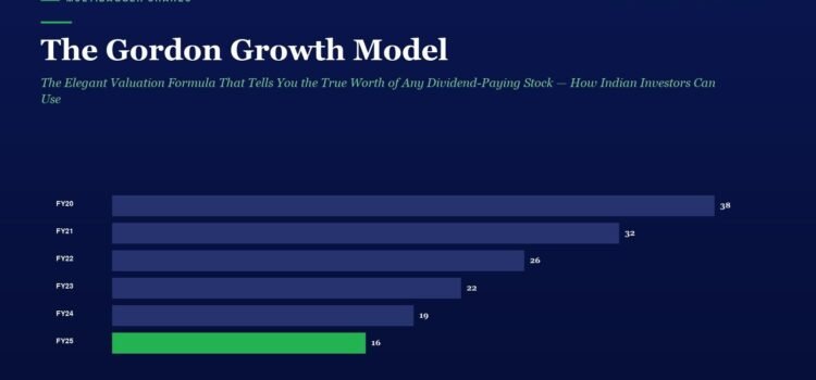
The Gordon Growth Model: The Elegant Valuation Formula That Tells You the True Worth of Any Dividend-Paying Stock — How Indian Investors Can Use This Timeless Method to Find Undervalued Compounders Before the Market Catches On

Horizontal bar chart showing yearly values from FY20 to FY25 on a dark blue background; FY20 38, FY21 32, FY22 26, FY23 22, FY24 19, FY25 16 (green highlight).

📅 Published April 07, 2026 (Tuesday) Table of Contents Toggle Why Most Indian Investors Get Valuation Completely Wrong What Is the Gordon Growth Model? The Logic Behind the Formula — Why It Works A Step-by-Step Example with an Indian Stock